

Why customers abandon shopping carts: 6 reasons and practical fixes
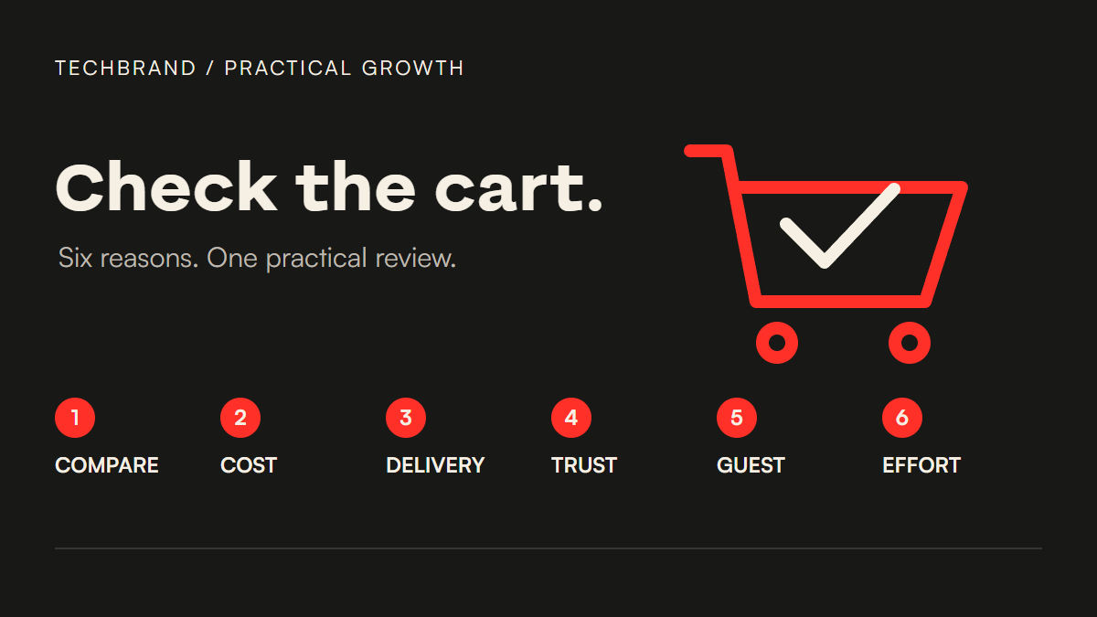
Customers leave shopping carts for different reasons. Some are comparing options. Others are ready to buy but stop when the cost, delivery promise or checkout asks too much of them.
Six useful places to start are browsing intent, extra costs, slow delivery, payment trust, forced accounts and a complicated checkout. These reasons appear in Baymard Institute’s cart-abandonment research. They are a starting checklist, not a diagnosis of your store or a universal ranking.
The checks below turn that research into a practical store review. You do not need to rebuild the whole shop to find a problem: choose one product, pick a delivery destination you actually serve, and follow the buying journey on a phone.
1. They are browsing or not ready to buy
Adding an item to a cart does not always mean “I am buying this now”. A shopper might be weighing two sizes, comparing prices or keeping a gift idea for later.
What to check: Can someone compare the information that matters before committing? For clothing, that might be measurements and fit. For a replacement part, it might be compatibility. Look for unanswered questions on the product page before assuming the checkout is the problem.
A practical fix: Make the product details easier to compare and, where useful, let people save an item without forcing a purchase. If your platform supports a persistent cart, test what happens when someone returns later. Do the selected variant and quantity survive?
Some people will still leave. Treat that as normal shopping behaviour; a discount is not automatically the right response.
2. Extra costs make the order feel too expensive
The product price is only part of the decision. Delivery, tax or other fees can change whether an order feels worthwhile.
A high delivery fee and a fee revealed late are different problems. Showing the fee sooner addresses the surprise. Whether the total is affordable needs a separate decision about the offer and its costs.
What to check: Write down the first point where a shopper can understand the likely total. If they must enter their contact details before seeing delivery costs, the information arrives late.
A practical fix: Show the costs you can calculate early, and explain what depends on the destination. A cart estimator can be more honest than a vague “shipping calculated later” message. State any genuine free-delivery threshold clearly; do not offer free delivery unless the business can support it.
For example, a store could show “Delivery calculated after you enter your postcode” beside an estimator. That wording is illustrative, not a template for your tax obligations or shipping terms. Use the rules that actually apply to your business.
3. Delivery will not meet their deadline
A shopper buying a birthday gift or a part for an urgent repair needs a realistic arrival estimate. An attractive price cannot resolve a missed deadline.
What to check: Does the site explain when the order is likely to arrive, or only say how long dispatch takes? These are different promises. Test a normal order and any item with a longer lead time.
A practical fix: Show an honest delivery window before payment. Account for processing time, destination and any relevant order cut-off. If express delivery is available, make its cost and limits clear. Avoid a countdown or “arrives tomorrow” badge unless your operations can fulfil it.
Ask the person who packs or dispatches orders to verify the wording. This is a delivery promise, not simply a design choice.
4. They do not feel comfortable entering payment details
A shopper may like the product and still hesitate at the payment screen. They need to understand who they are paying and what happens if something goes wrong.
What to check: From the cart, can someone find your business identity, contact options and returns information? Does the payment journey look consistent with the rest of the store? Are the payment options you advertise actually available?
A practical fix: Make those answers easy to find and use reputable payment services that your store really supports. Explain an expected handoff to an external payment provider so it does not feel like an unexplained change of destination.
A decorative security badge is no substitute for a secure implementation. Do not add certification marks, payment logos or customer endorsements that you are not entitled to use.
5. The store forces them to create an account
Someone making a one-off purchase may not want another password before they can pay.
What to check: Open the store in a fresh browser session. Is guest checkout easy to see, or does a large login form make it look as though registration is required? Test without using an existing customer account.
A practical fix: Offer guest checkout where your business and platform allow it. Make optional registration clearly optional. If an account provides a useful benefit, explain that benefit and consider offering account creation after the purchase.
Some products or services genuinely require an account. In that case, explain the reason before asking someone to register, and remove registration fields that do not serve that need.
6. Checkout takes too much effort
Unnecessary fields, unclear instructions and awkward mobile forms can interrupt an otherwise straightforward purchase. Baymard’s checkout guidance explains why reducing avoidable friction matters.
What to check: Complete each step on a phone using a normal delivery address. Notice where you hesitate. Are required fields clear? Does an error explain how to fix the entry? Can you go back without losing what you typed?
A practical fix: Remove fields you do not need, label the remaining ones plainly and make the order review easy to understand. Use appropriate autocomplete and input types where the platform supports them. Test a mistyped postcode, an unavailable delivery destination and a payment failure in a test environment.
The aim is a clear purchase journey. Combining everything onto one page is not automatically an improvement if the result becomes harder to follow.
Use this checklist on one order
- Choose one product and a realistic delivery destination.
- Check whether the shopper can compare or save it.
- Find the first clear total-cost and arrival information.
- Check business, contact, payment and returns details.
- Try guest checkout in a fresh session.
- Follow every step on a phone and record the first point of confusion.
Start with the most consequential problem you can reproduce. Record what happened, where it happened and what you changed. Then check the same journey again.
If you have reliable checkout reporting, compare the relevant step before and after the change over a suitable period. Keep traffic source, device and promotions in mind: a rise in completed orders alone does not prove one design change caused it.
Common questions
Is every abandoned cart a lost sale?
No. Some shoppers use a cart while comparing or planning. Research on abandonment helps identify useful checks; it does not tell you that every visitor intended to purchase.
Should I send a discount to everyone who leaves?
First find out whether the problem is information, cost, timing or effort. A discount does not repair an unclear delivery promise or a broken form. Any recovery messages also need an appropriate lawful basis and channel permissions.
Which checkout problem should I fix first?
Begin with a reproducible failure that prevents a purchase or hides essential information. If several issues remain, use your own customer feedback and reliable step-level reporting to set the order.
Your next step: Run the six checks on one product today. Keep a short list of the questions the site fails to answer before changing the design.
Need help fixing the buying journey?
Techbrand connects website and ecommerce work with the delivery and follow-up behind it. See our services, then tell us where customers get stuck. Include your store URL and the first step you could not complete; do not send payment details or customer records.

Related Posts
Why your business is not showing on Google Maps: 7 checks to make first
A missing profile and a low search…
